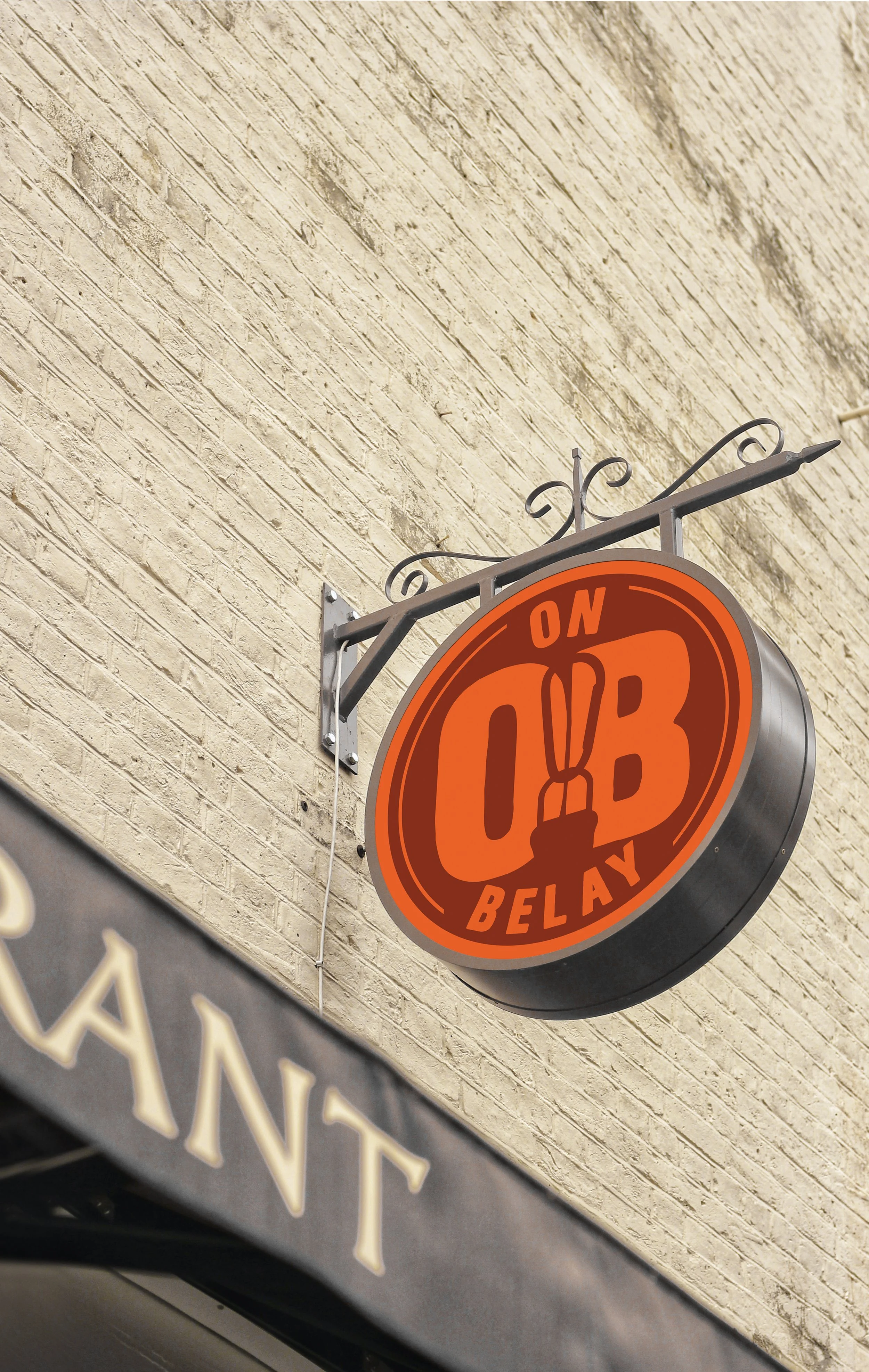
Branding for a fictional Climbing goods store.
This project was an opportunity for me to create a brand identity for a store type that I chose. Some elements of this project included gathering research, designing the logo, fonts & color, and showcasing applications. These were all brought together to create a sense of unity for the brand to properly present the business.
Process
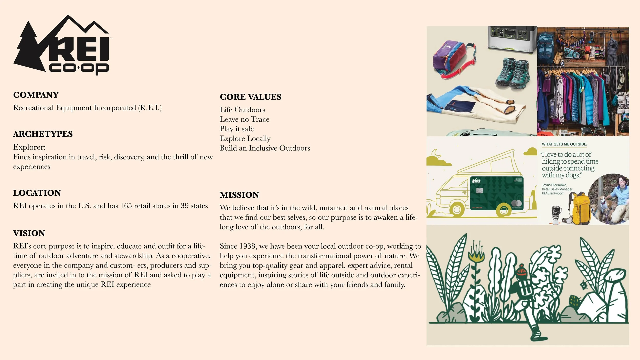
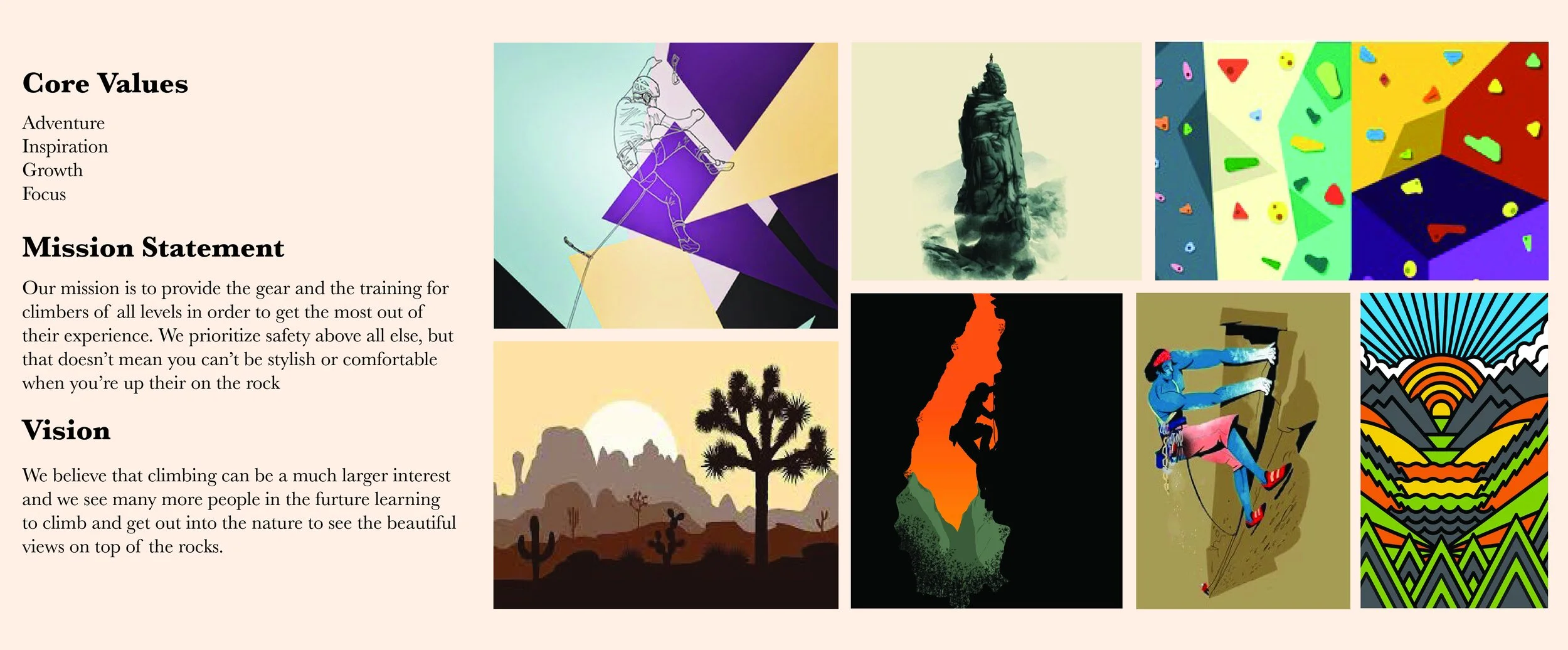
I started the process by making a small list of core values and a mood board that I wanted the brand’s identity to be associated with. The mood board was made to mirror the core values as well as to display the proper aesthetic for the brand. The specific images were chosen to give the brand a rough cartoon feel.
This research of competitive brands was used for comparisons to see what worked and didn’t work for similar companies.
Concepts
Refinement
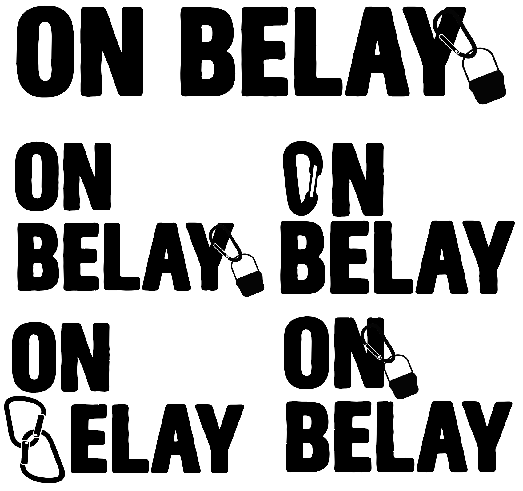
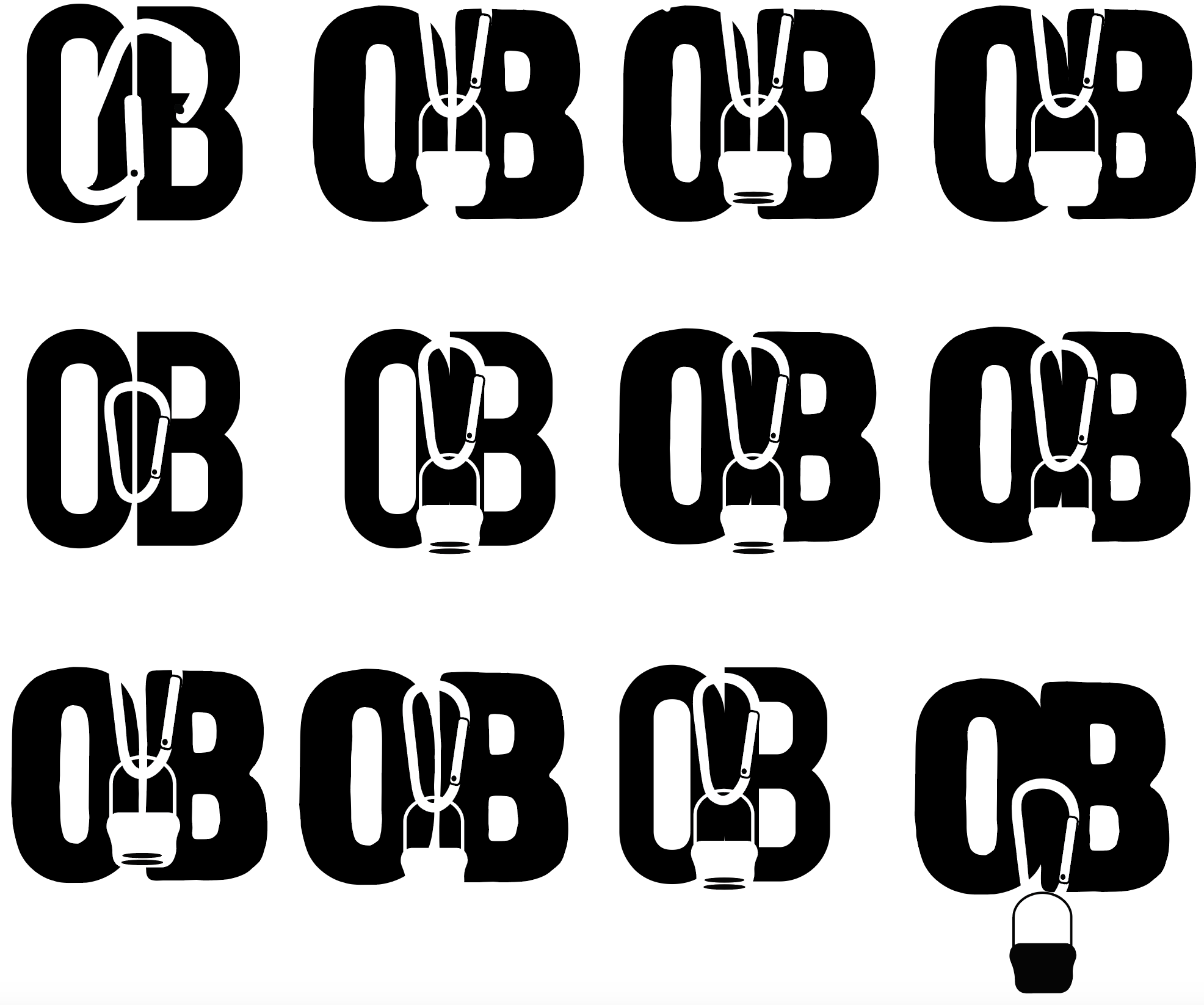
Logo Iterations
B&W
Color
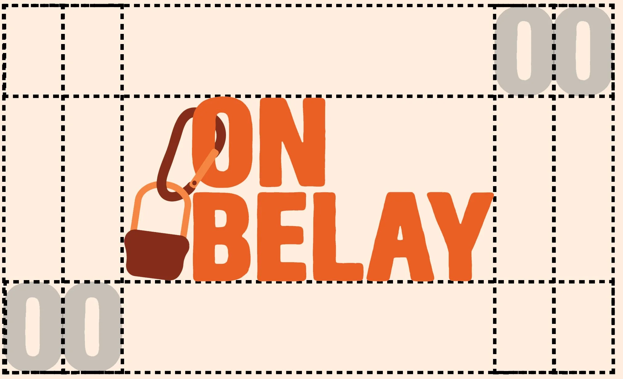
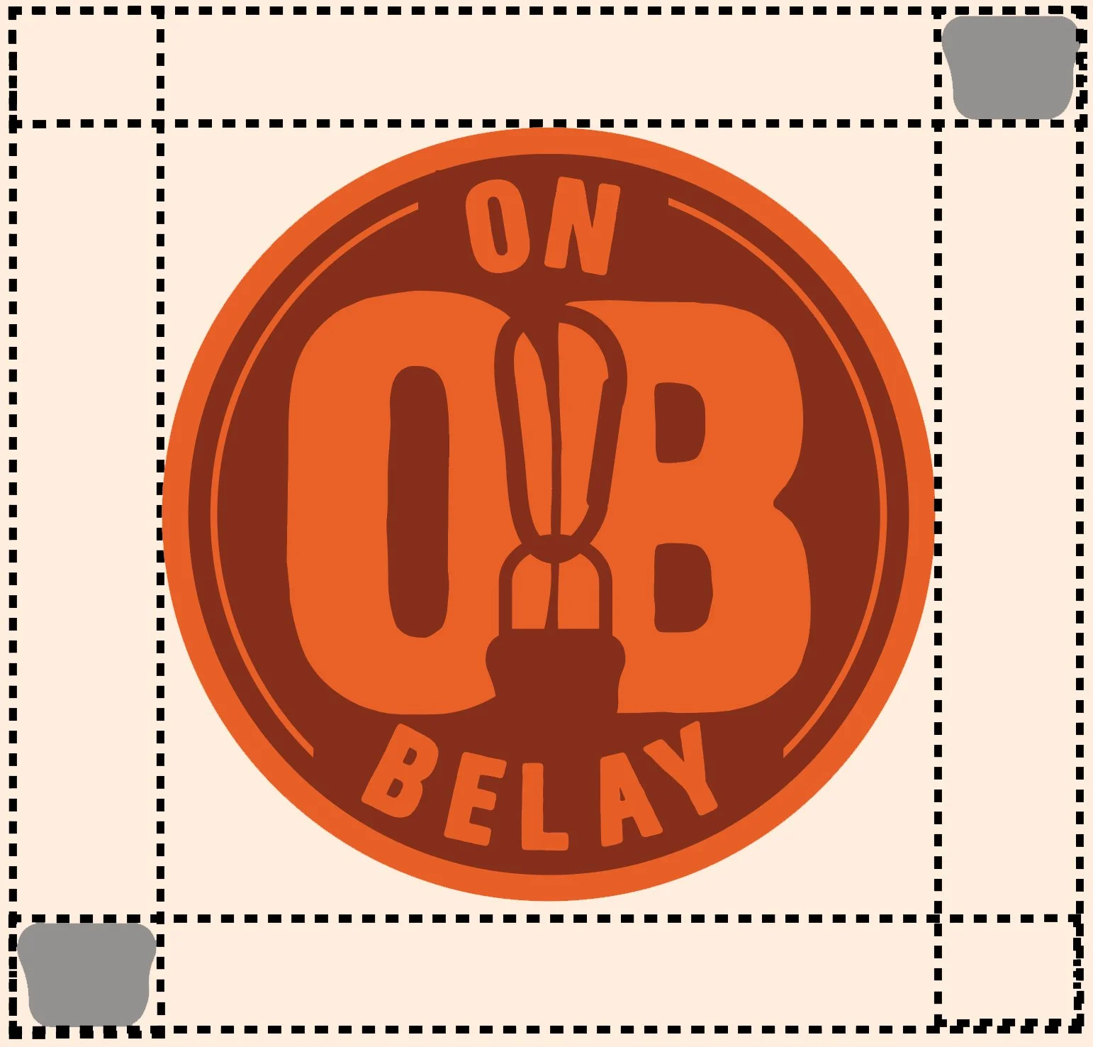
Logo Staging
The proper spacing for each of the logo iterations was creating by taking pieces from both and using them to show how much space there should be. The left logo took two of the “O” from the word mark and the logo on the right used the bottom portion of the favicon.
Improper usage
These examples show the negative impact that can be had on the logo should they make any of the following manipulations.
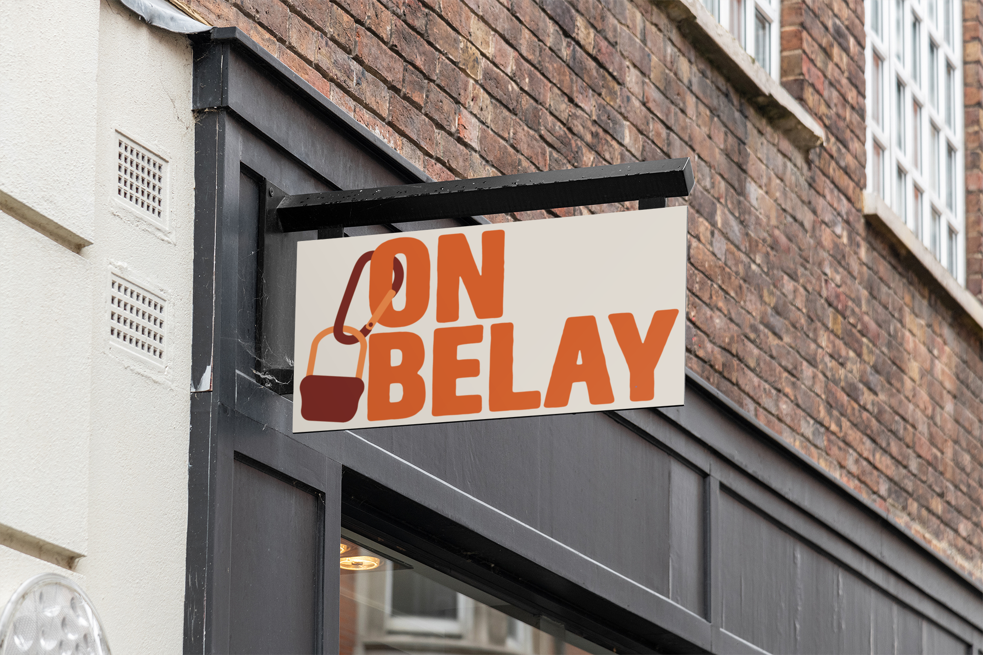
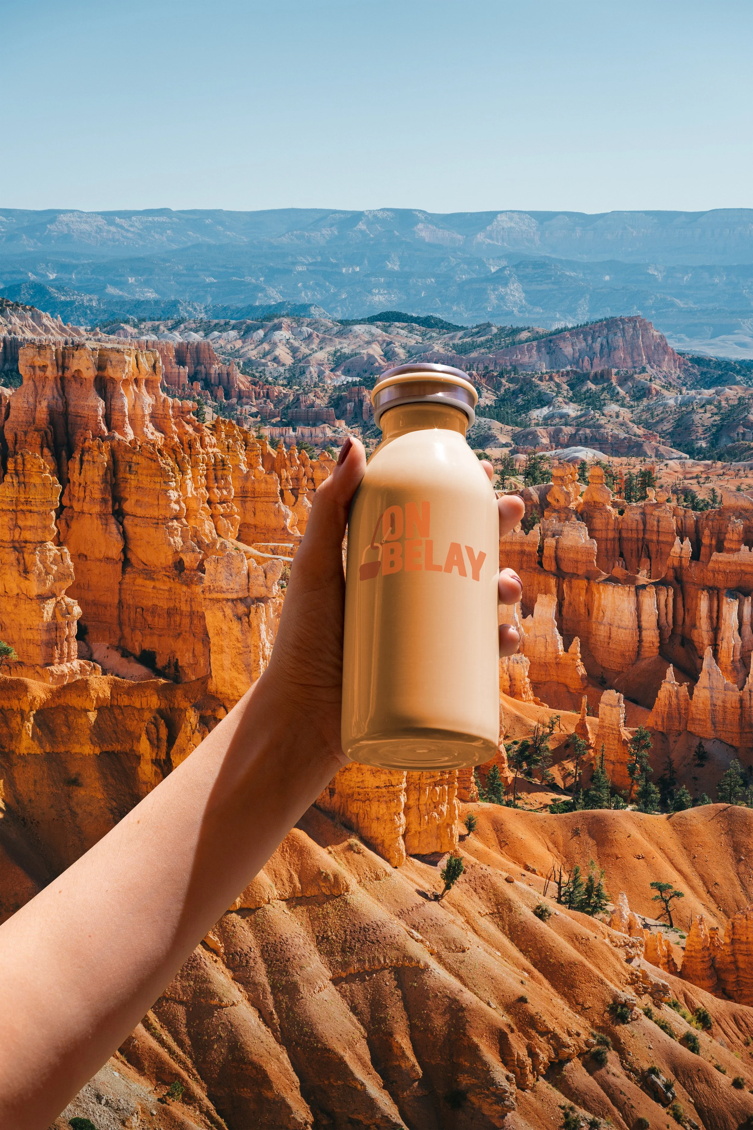
Applications
Reversed
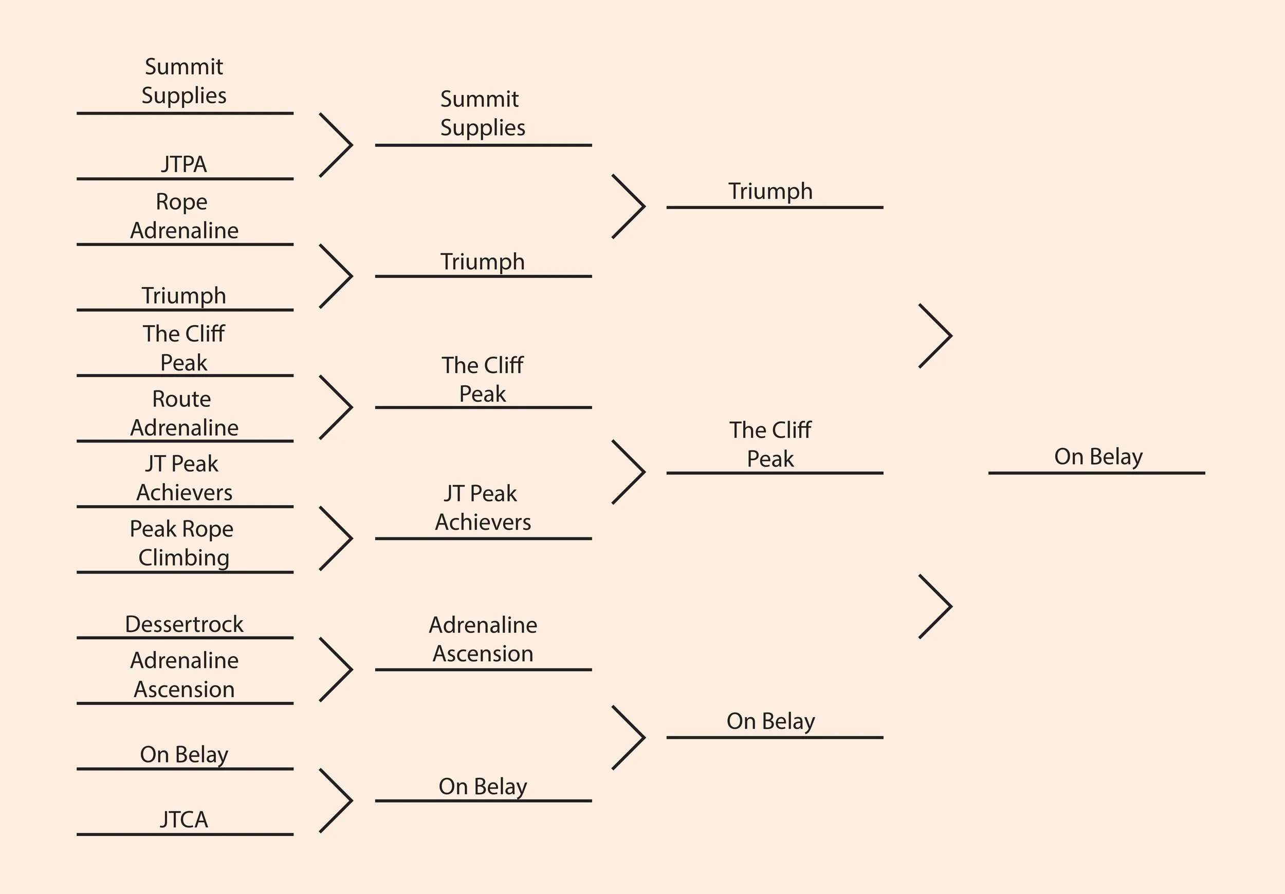
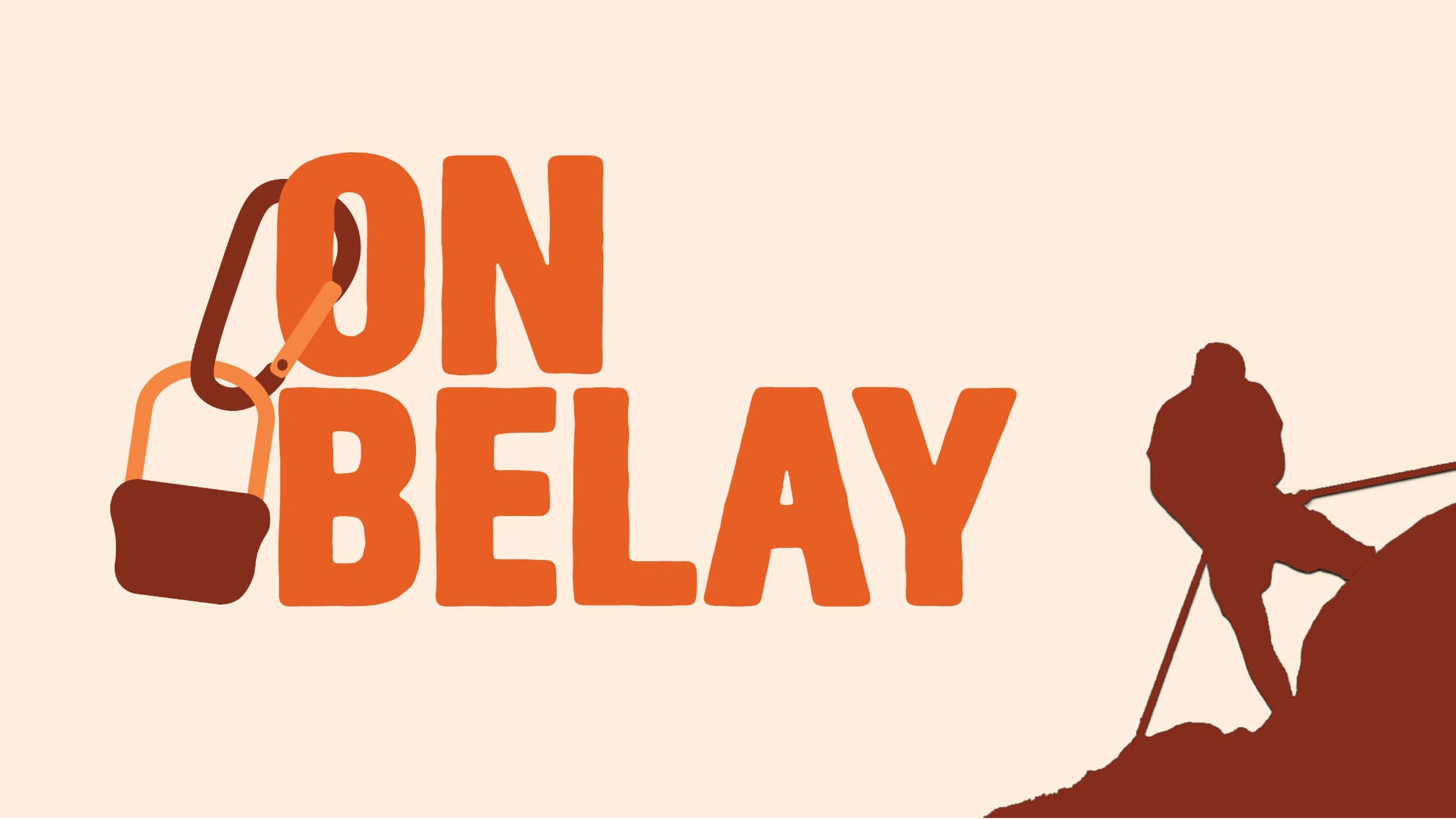
When going through the name making process the idea that was to be stressed the most was that it included an element that related to climbing. After gathering a list of words and phrases that were closely related to the brand they were used to create a number of potential names. Eventually the name that was chosen was “On Belay”, a very common and well known climbing phrase.

